Night photography post-processing: A Warm Car on a Cool Night
During the second afternoon of last week's Pearsonville Night Photography and Light Painting Workshop, Troy Paiva and I critiqued 4 images from each participant -- our goal was to help everyone make better photos the second night. Seeing all of the amazing work from the first night before shooting again was really inspiring. A lot of the photographers have uploaded images to the Pearsonville Workshop Flickr Group, and Troy and I have provided some further comments online.
During last Fall's workshop, I offered to make a 16x20" print of the image that Troy and I decided was our favorite from the first night. The winning shot was by Aaron Siladi, and the print is now hanging on his wall. Last week we upped the ante by providing a 16x20" print and a Hostess Chocodile. I thought the Chocodile was extinct, but the Fastrip in Ridgecrest still has 'em (although they no longer feature the Chauncey the Chocodile mascot I remember from my youth).
Anyhow, the image above by photographer David Dasinger was the Chocodile (and print) winner this time. David's well placed addition of light to the underside of the hood was an extremely creative move that really brings out shape and texture of this mashed up beauty. Here's a few words from David about how he lit the image:
Kept it super simple. 2 minute exposure, f/5.6, Stinger flashlight, just held it facing up under the hood crease and gave it about a 30 degree arc. The Stinger is so bright it was very quick. This one was about all that moonlight and the crinkly hood.
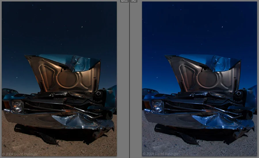
While working on the print over the last few days, I asked David if I could use his image as a split-conversion post-processing example and he agreed. Above are two different interpretations of the RAW file using the Virtual Copy feature in Lightroom. The warm version on the left is has a color balance of 4450K, and the cool version on the right is 3250K. I really like the orange against blue motif on the car in the warm version, but prefer the deep cyan sky of the cool version. Why not have the best of both worlds? Below is a step-by-step of how I combined the two versions of the file to make a print:

- Bring both versions of the file into a Photoshop CS3 file, with the cool version as the top Layer.
- Use the Quick Selection Tool to select the sky (screenshot above), and use the Refine Edge tool to slightly feather the selection.
- Select the Channels palette, and click the "front loading washer" to make an Alpha Channel out of the selection.
- Go back to the Layers palette, select the top layer (cool version), and click the "front loading washer" to load the Alpha Channel as a Layer Mask.
- The opacity of the top layer to was reduced to 50% to have the sky look saturated but realistic (see version 1 below) . The reduced opacity and feathered mask selection are both useful ensuring a smooth transition from sky to ground.

After dialing in the sky and foreground balance, I flattened the file, converted to the ICC profile of my printing service, and sharpened for output. The sky and the hood looked great in the first print, but the sand in the foreground was a little too orange, and the tonal value of the car's front grill needed to be slightly brighter. I made a few quick adjustments to the master file as follows:
- Add a Curves Layer, increase the Green in the 3/4 tones -- on the Layer Mask, paint in the effect in on the ground using a soft brush at a low opacity.
- Add a Hue/Saturation Adjustment Layer, slightly reduce the Saturation of Red and Yellow -- on the Layer Mask, paint in the effect in on the ground using a soft brush at a low opacity.
- Play with the opacity of both Adjustment Layers until the foreground looks right.
- Add a Curves Layer to increase the brightness of the grill and engine area -- on the Layer Mask, paint in the effect using a soft brush at a low opacity.

If you are intimidated by Layer Masks, I highly recommend Katrin Eismann's book Photoshop Masking & Compositing.
By neutralizing the ground just slightly, and bringing out the 3/4 tones on the front grill and engine compartment, more attention is focused on our main subject, the car. This effect is subtle on the web, but makes a big difference in a 16x20" print. Going back and doing a second or third round of adjustments on a print until it looks right is a great learning experience, and an important part of finishing the work. Below is the final image.

Many thanks to David Dasinger for allowing me to use his beautiful image for this post-processing demo. And thanks to all of the workshop participants for their spirit of adventure and creativity -- Chocodiles for everyone, I am still dreaming of cars!